
In the datawrapper.de visualizations service a “Split-Bars” plot is available, the screenshot below is an example.

The data visualization is already very informative and clearly visualizes the tabular data. However, I would like to recreate this kind of visualization plot type programmatically in Python; i.e. using matplotlib (or similar library). As far as I searched, I did not find this type of plot available within the plot galleries or APIs of matplotlib, seaborn, plotly, gnuplot, or any other libraries I could think of.
Defining the Problem:
Problem Description: The structure seems to be table format; with each cell filled with a shaded area; to a given filled-percentage. Axis lines are removed. Value-text colors change depending on background color. Value-text positions change depending on % value.
Attempts: ChatGPT recommended ax.imshow() to generate each cell with colors, but (AFAIK) it lacks %-filled functionality. I looked towards ax.fill_between(), however this can only attach to a line along the axis (X or Y). Finally I moved to ax.add_patch(Rectangle(...)), which seems to be the ideal choice for the inner ax %-filled color-patches and the outer ‘legend’ color patches . Using this final approach was fruitful.
Github Repo / PIP Library
The python code (as a pip package) is now on this Github repo under the AGPLv3 (GNU Affero General Public License). That way its easy to install and use the library for future plots; and with the GNU license, it’s free to reuse and modify for inclusion as a gallery example or plotting library code, etc.
Example Colab Notebook
There’s an example notebook in Google-Colab, to see a working example of install and creating the split-bar plot for various datasets.
Installation via Pip:
(Use !pip for notebook installations, Jupyter, Colab, etc.)
pip install git+https://github.com/pmdscully/plot_split_bar.git
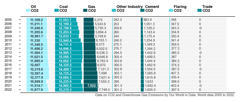
Example : Usage with Global CO2 emissions from fossil-fuel data:
from splitbar import plot_split_bar
import pandas as pd
import numpy as np

df = pd.read_csv('https://github.com/owid/co2-data/raw/master/owid-co2-data.csv')
columns1 = ['year','oil_co2','coal_co2','gas_co2','other_industry_co2','cement_co2','flaring_co2','trade_co2',]
data = df[(df['country']=='World') & (df['year']>=2005)][columns1].set_index('year').iloc[::-1]

plot_split_bar(data=data.to_numpy(),
               rows=data.index,
               columns=[c.replace('_',' ').title().replace('Co2','\nCO2') for c in data.columns],
               precision=1,
               fn_suffix='world_co2',
               lower_caption='Data on CO2 and Greenhouse Gas Emissions by Our World in Data. World data 2005 to 2022.',
               fig_size=(7, 3),
               WRITE=True
              )
Output:
Additional Info on how to use:
- Control the proportions of the plot:
- For different sized dataset, the Matplotlib
fig_size(function argument) needs to be reset to make the plot image appear in good proportion.
- For different sized dataset, the Matplotlib
- Use a dataset with more than 7 columns:
- The `colors` argument is currently set with seven(RGB) colors, so for more than seven columns, we need to replace that with an array from a colormap. Here’s some code to generate a new RGBA array:
import matplotlib
n = 9
colormap_name = ['cool','Wistia','viridis','Spectral','plasma','RdBu','bwr','seismic','hsv'][2]
cmap = matplotlib.colormaps[colormap_name]
bounds = range(n)
norm = matplotlib.colors.BoundaryNorm(bounds, cmap.N, extend='both')
colors = matplotlib.cm.ScalarMappable(norm=norm, cmap=cmap).to_rgba(bounds)
Reflections / Limitations
The implementation does not quite have all the components of the datawrapper.de visualization, such as the legend positioning and column headings, etc. The Roboto font is a nice choice by dw, however it’s not always available with matplotlib/ anaconda / Python-distributions; so that’s an optional extra (default_font argument).
I hope others might pick the code as a starting point and improve from there. Good luck!

